2012 Republican Delegate Count Graphs
This is the archived version of the final state of the 2012 analysis. For 2016, see ElectionGraphs.com.
Welcome visitors. In addition to the 2012 election information here, please also check out one or more of the Abulsme.com blog, the Curmudgeon's Corner Podcast, the True Binary Time Clock, the Abulsme Random Spot Tool, the Mathematically Random Trips and the AbulCam. If you find any of this interesting, please do come back.
The following are graphs of the delegate counts for the US presidential race in both parties on a day by day basis. At a minimum, graphs will be updated after new primary and caucus results. Changes to superdelegate totals between primaries and caucuses may or may not be caught on the day they occur. The data source for delegates that are determined by primaries and caucuses is thegreenpapers.com which includes "soft" delegates and estimated delegates as well as "hard" fully pledged delegates. The data source for "Automatic Delegates", which were routinely called SuperDelegates in 2008 is Democratic Convention Watch (yes, even though these are Republicans). The spacing of the data points reflects the time of day (UTC) at which I take the "sample". On days when primary and caucus results come in the data points may represent estimates which are later revised in the next day's data points.
2012 Electoral College Prediction charts are also available.
The historical version of these charts from the last election cycle is available at: 2008 Presidential Delegate Graphs
Republicans
Final Results
| Stage | Bachmann | Gingrich | Huntsman | Paul | Perry | Romney | Santorum | Roemer | NV/Unk |
|---|---|---|---|---|---|---|---|---|---|
| Peak | 2 | 159 | 2 | 173 | 6 | 1571 | 268 | 0 | |
| Final Est | 1 | 142 | 0 | 173 | 0 | 1555 | 247 | 0 | 168 |
| Roll Call | 1 | 0 | 1 | 190 | 0 | 2061 | 9 | 1 | 23 |
| Official | 0 | 0 | 0 | 0 | 0 | 2061 | 0 | 0 | 255 |
Peak represents the highest delegate estimate the candidate had during the primary season (not counting the final convention results).
The final estimates reflect the best estimates used here as of the "end" of the primary season. Specifically this is the estimate on August 22nd 2012, right before Gingrich and Santorum released their delegates. These released delegates were then free to vote for whoever they wanted in the Roll Call.
The roll call represents the count of the votes verbally given by the states at the Roll Call at the convention on August 28th 2012. (There were five votes in Pennsylvania that some reported as going to Paul Ryan, others have said the speaker said "Paul, Ron". I believe these were intended for Ron Paul, so have counted them as such.)
The official count represents the vote as recorded by the convention. Romney was the only candidate who was officially nominated and seconded at the convention, so therefore was the only candidate who could officially receive votes and have them registered. Officially any votes for anybody else were equivalent to abstentions.
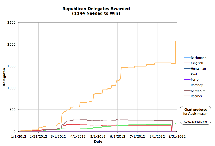
The charts below use the Roll Call results (not the official results) for the final data point.
Primary Season Charts
Charts below represent the delegate race from 1 Jan 2012 until the present.
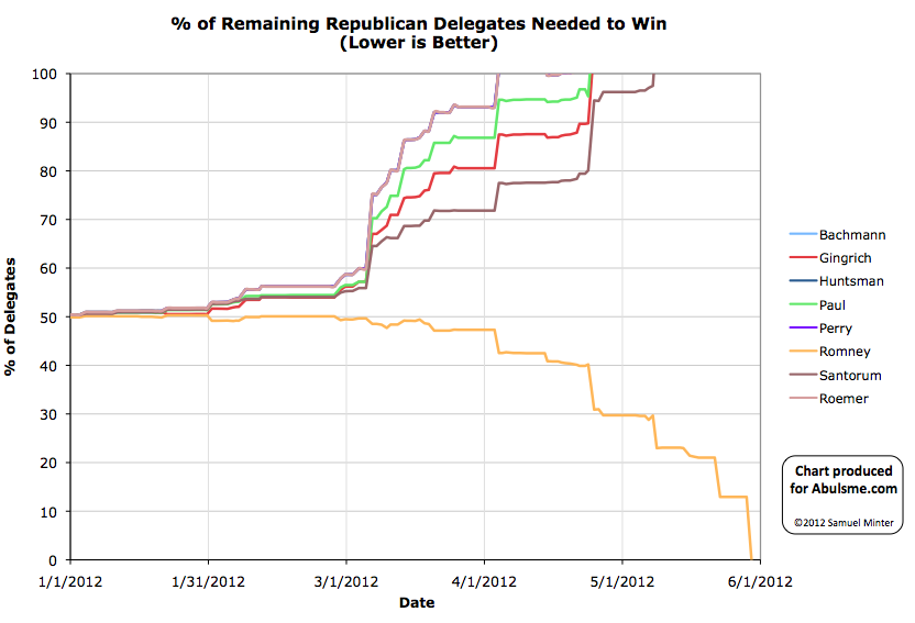
The chart above represents the % of the remaining available delegates the candidate needs to cinch the nomination. So when a candidate goes over 100%, it is no longer mathematically possible for them to win the nomination. When a candidate hits 0% they have won the nomination. Both of course absent the possibility of delegates changing their minds or violating their pledges. Delegates which are estimated but not yet final may also change these results one they are finalized.
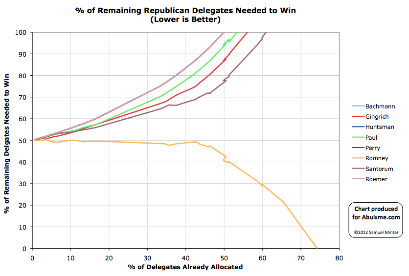
This chart shows the exact same thing as the first chart, but with the horizontal axis being the percentage of delegates allocated so far rather than the date. This allows one to more easily see how far through the race we are, divorced from the specifics of the primary calendar. This also allows for comparisons with other election cycles with different calendars.
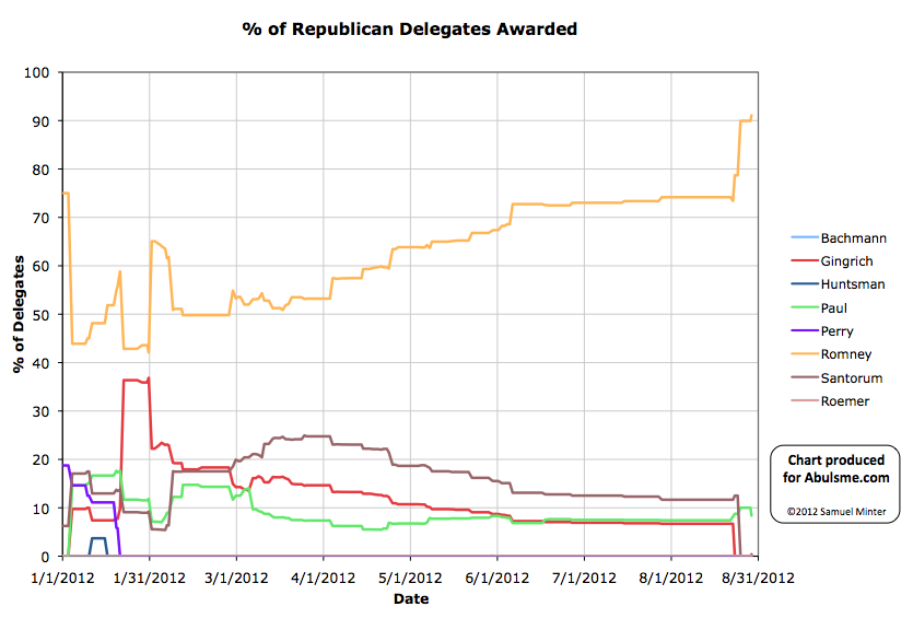
Of course, candidates get to the point of not having any realistic chance long before they are mathematically eliminated. One way to get a sense of this is by comparing to the chart below, which shows the percent of delegates the candidate has gotten so far. If the percentage he needs to get of the remaining delegates is significantly more than the percentage they have gotten so far, then the chances of them suddenly starting to get that higher percentage is also low.
Commentary on Graph Updates
- See Tag: 2012 Republican Delegates for all posts related to updates of these charts.
- See Tag: Election 2012 for more general commentary on the 2012 election cycle.
Democrats
There were no major challengers to Barack Obama in 2012, so graphs and charts of the Democratic race were not included directly on this wiki page. The spreadsheet with the raw data linked here did however include tracking for the Democratic race. At various points in the race it looked like several minor candidates (Terry, Rogers, Wolfe, Judd) might earn a small handful of delegates. In the end this did not come to pass. The final roll call tally at the Democratic Convention was 5424 Obama, 128 not voting.
Data and Sources
The spreadsheet used to generate these graphs is here.
The sources used are:


