2008 Electoral College Prediction
This is the archived version of the final state of the 2008 analysis. For 2016, see ElectionGraphs.com.
Welcome visitors. In addition to the 2008 election information here, please also check out one or more of the Abulsme.com blog, the Curmudgeon's Corner Podcast, the True Binary Time Clock, the Abulsme Random Spot Tool, the Mathematically Random Trips and the AbulCam. If you find any of this interesting, please do come back.
Everything below represents the final state of the 2008 Electoral College Prediction Pages on Abulsme.com at the conclusion of the 2008 election cycle. This is now presented for archival purposes. For 2012 information, please look to 2012 Presidential Delegate Graphs and 2012 Electoral College Prediction. For 2016, see ElectionGraphs.com.
2008 Campaign
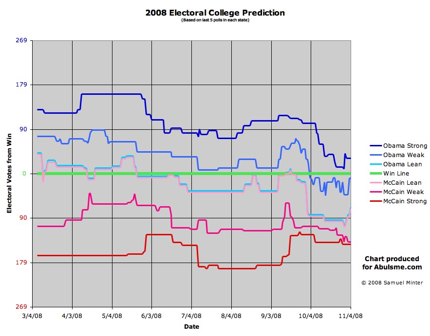
Electoral College Graph
(Data is shown since 7 Mar 2008, which was the first day data was available for 50 states.)
Plot shows support lines for both candidates. The scale shown is how many electoral votes away from winning the candidate is if only states with that level of support are included. If the line passes over into the other candidates "side" of the chart, it indicates that candidate is winning. All lines are based on an average of the last five polls in each state.
Note: After 18 Sep 2008, the first date there were polls for DC, the lines for "Obama Lean" and "McCain Lean" would overlap exactly and only one would be visible. From that date forward the lines have been forced slightly apart so they can still both be seen. The actual location of both lines would be the center of the pink/blue band. Prior to that date, the gap between the two lines was real, and represented the fact that there were 3 electoral votes that were not yet predicted by any polls. (Although of course the disposition of DC was never really in doubt.)
Electoral College State Breakdown
| McCain Strong | McCain Weak | McCain Lean | Obama Lean | Obama Weak | Obama Strong |
|---|---|---|---|---|---|
|
Texas (34) |
West Virginia (5) |
Georgia (15) |
Florida (27) |
Pennsylvania (21) |
California (55) |
| 127 | 5 | 68 | 60 | 40 | 238 |
| 132 | 128 | 278 | |||
| 200 | 338 | ||||
| 538 | |||||
Number of electoral votes for each state in parenthesis. 270 electoral votes required to win.
Potential Totals
| McCain | Obama | |
|---|---|---|
| McCain Best Case | 260 | 278 |
| Current Status | 200 | 338 |
| Obama Best Case | 132 | 406 |
The "Best Cases" assume that each candidate gets all of their strong and weak states, along with ALL of the leaning states, even those currently leaning to their opponent. The "Current Status" assumes each candidate gets their strong, weak and lean states. The winner in each scenario is highlighted in green. In a tie, both candidates are highlighted.
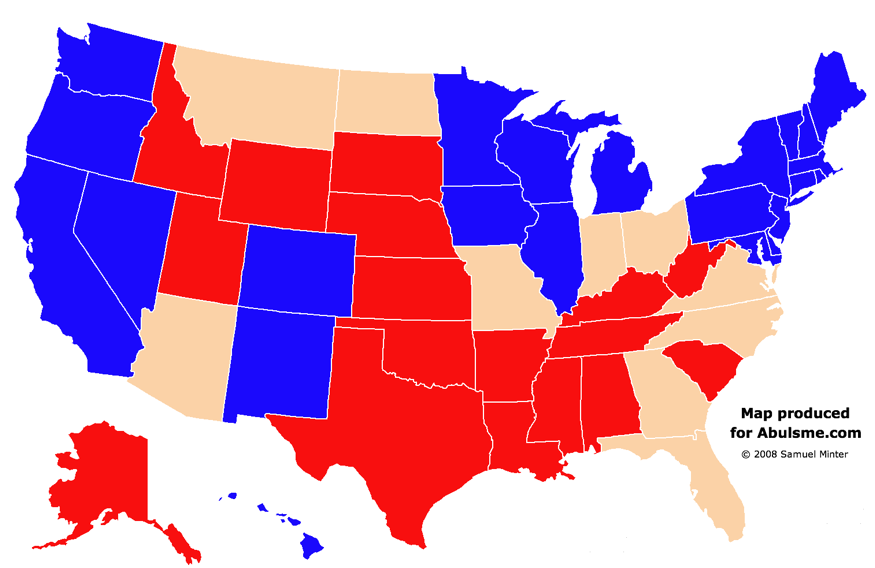
Map
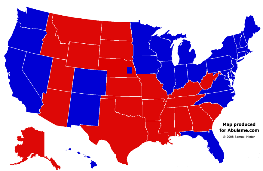
All Lean states are colored tan. Weak and Strong states are both colored red for McCain and blue for Obama.
Base map from Wikimedia Commons.
Commentary on Graph Updates
For all recent commentary on graph updates see the Electoral College Category on the Abulsme.com blog.
For commentary from specific dates use the links below.
Explanation
This page shows a prediction of the 2008 Electoral College Presidential Vote based exclusively on state by state poll results. Probable results based on previous elections and anecdotal stories of the state's tendencies are not included. The polls include all state based head to head general poll results listed on either pollster.com's poll update page or pollster.com's state by state detail pages. National polls are ignored since the national popular vote is of course irrelevant in a Presidential election. I include all polls from these sources starting from November 5th, 2007... one full year before the 2008 general election.
Support levels are defined as:
- Lean: 0% ≤ Candidate Lead < 5%
- Weak: 5% ≤ Candidate Lead < 10%
- Strong: Candidate Lead ≥ 10%
For purposes of this page, I use the average of the last five polls in each state. In the case where the average of the last five polls shows an exact tie, I will keep the state in the leaning category of whichever candidate was ahead prior to the newest poll pending further polls to pull the state to one side or another.
In cases where the numbers on Pollster's poll update blog differ from the numbers in the state detail page, I will generally prefer the numbers which appeared earlier, unless there is an indication that there was an error which was corrected. In cases where a poll is added to both locations on the same day (common) and they disagree (uncommon) I will prefer the poll update blog to the state detail page. In cases where a poll reports numbers both with and without third parties, I will use the results which include third parties.
I do not use Pollster's trend estimates, favoring the "most recent five polls" approach. There are pros and cons to both methods. I choose the last five polls method basically because when this page was started, Pollster.com trend estimates were not available for most states and it was simple to do. I continued using the same method, because changing mid-stream would make looking at the trends over time less valid. In addition, Pollster.com is creating their own maps based on their trend estimates, and this provides a different view.
The two "lean lines" have met now that there are polls for all 50 states and the District of Columbia.
The graphs assume that no third party candidate will enter the race that is strong enough to actually win electoral votes. If that changes, I will remake this page appropriately.
The spreadsheet used to generate these graphs is here.
In response to a discussion on the Straight Dope Message Boards, I've posted an examination of how the results would change on a typical day (18 Oct 2008 in this case) if I used the last 10 days worth of polls rather than the last 5 polls.
2008 Election Night Detail
Introduction
This is an extension of the Full Year charts which will reflect any final election day polls, and the actual election results as states are called. For purposes of this page, states will be "called" when CNN calls them. The charts and graphs below show changes of status over time as November 4th and 5th proceed.
Times listed are UTC.
To get Eastern Time, subtract 5 hours. For Central, subtract 6. For Mountain, subtract 7. For Pacific subtract 8. Etc.
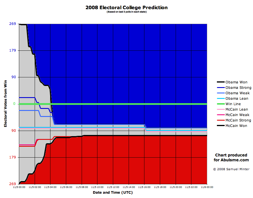
Electoral College Graph
(Data is shown starting 00:00 UTC on November 5th... the time at which polls were first closed in complete states. (7 PM Eastern on November 4th.) See below for poll updates from election day.)
Plot shows support lines for both candidates. The scale shown is how many electoral votes away from winning the candidate is if only states with that level of support are included. If the line passes over into the other candidates "side" of the chart, it indicates that candidate is winning. All lines are based on an average of the last five polls in each state. The dark filled in area represents states where results have already been called by CNN.
Note: The lines for "Obama Lean" and "McCain Lean" would overlap exactly and only one would be visible if they were shown in their correct positions. The lines have been forced slightly apart so they can still both be seen. The actual location of both lines would be the center of the pink/blue band.
Map
All Lean states are colored tan. Weak and Strong states are both colored faded red for McCain and faded blue for Obama. As states are called for either candidate they will become dark red or blue.
Base map from Wikimedia Commons.
Electoral College State Breakdown
| McCain Won | McCain Strong | McCain Weak | McCain Lean | Obama Lean | Obama Weak | Obama Strong | Obama Won |
|---|---|---|---|---|---|---|---|
|
Texas (34) |
California (55) | ||||||
| 173 | 0 | 0 | 0 | 0 | 0 | 0 | 365 |
| 173 | 0 | 0 | 365 | ||||
| 173 | 0 | 365 | |||||
| 173 | 365 | ||||||
| 173 | 0 | 365 | |||||
Number of electoral votes for each state in parenthesis. 270 electoral votes required to win.
- Nebraska's five electoral votes were split. 4 for McCain, 1 for Obama
Potential Totals
| McCain | Obama | |
|---|---|---|
| McCain "SuperBest" | 173 | 365 |
| McCain Best Case | 173 | 365 |
| Current Status | 173 | 365 |
| Obama Best Case | 173 | 365 |
| Obama "SuperBest" | 173 | 365 |
The "Best Cases" assume that in addition to any states already called for the candidate, each candidate gets all of their strong and weak states, along with ALL of the leaning states, even those currently leaning to their opponent. The "Current Status" assumes each candidate gets their strong, weak and lean states. The winner in each scenario is highlighted in green. In a tie, both candidates are highlighted.
Because McCain is so far behind going into Election Day, I have added "SuperBest" scenarios... where the candidate wins everything they are ahead in, plus all of their opponents Lean and Weak states.
Commentary on Graph Updates
For all recent commentary on graph updates see the Electoral College Category on the Abulsme.com blog.
For commentary from specific times use the links below.
.
Election Day Polling Updates
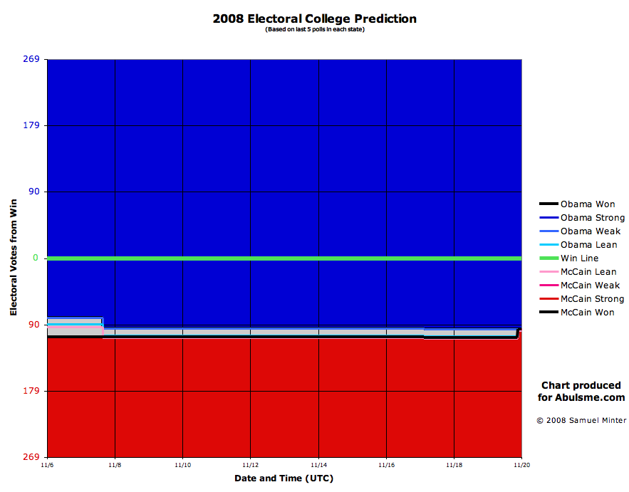
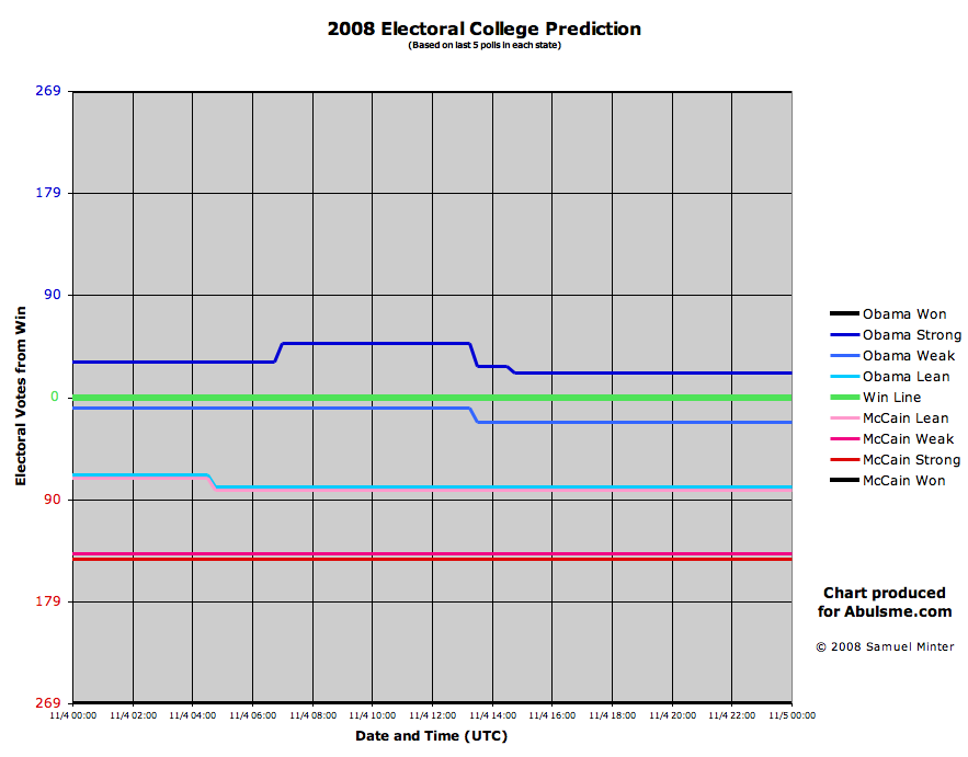
(Data is shown from Nov 4 00:00 UTC to Nov 5 00:00.)
Plot shows support lines for both candidates. The scale shown is how many electoral votes away from winning the candidate is if only states with that level of support are included. If the line passes over into the other candidates "side" of the chart, it indicates that candidate is winning. All lines are based on an average of the last five polls in each state. The dark filled in area represents states where results have already been called by CNN.
Note: The lines for "Obama Lean" and "McCain Lean" would overlap exactly and only one would be visible if they were shown in their correct positions. The lines have been forced slightly apart so they can still both be seen. The actual location of both lines would be the center of the pink/blue band.
Explanation
This page shows a prediction of the 2008 Electoral College Presidential Vote based exclusively on state by state poll results. Probable results based on previous elections and anecdotal stories of the state's tendencies are not included. The polls include all state based head to head general poll results listed on either pollster.com's poll update page or pollster.com's state by state detail pages. National polls are ignored since the national popular vote is of course irrelevant in a Presidential election. I include all polls from these sources starting from November 5th, 2007... one full year before the 2008 general election.
Support levels are defined as:
- Lean: 0% ≤ Candidate Lead < 5%
- Weak: 5% ≤ Candidate Lead < 10%
- Strong: Candidate Lead ≥ 10%
For purposes of this page, I use the average of the last five polls in each state. In the case where the average of the last five polls shows an exact tie, I will keep the state in the leaning category of whichever candidate was ahead prior to the newest poll pending further polls to pull the state to one side or another.
In cases where the numbers on Pollster's poll update blog differ from the numbers in the state detail page, I will generally prefer the numbers which appeared earlier, unless there is an indication that there was an error which was corrected. In cases where a poll is added to both locations on the same day (common) and they disagree (uncommon) I will prefer the poll update blog to the state detail page. In cases where a poll reports numbers both with and without third parties, I will use the results which include third parties.
I do not use Pollster's trend estimates, favoring the "most recent five polls" approach. There are pros and cons to both methods. I choose the last five polls method basically because when this page was started, Pollster.com trend estimates were not available for most states and it was simple to do. I continued using the same method, because changing mid-stream would make looking at the trends over time less valid. In addition, Pollster.com is creating their own maps based on their trend estimates, and this provides a different view.
For election day only, I am including polls as soon as I find them anywhere, even if pollster.com has not yet logged them.
As winners in each state are called by CNN, they will be moved into the appropriate "Won" column.
The spreadsheet used to generate these graphs is here.
